 |
Most of the news of the 51st Venice Biennial is
dominated by the two main
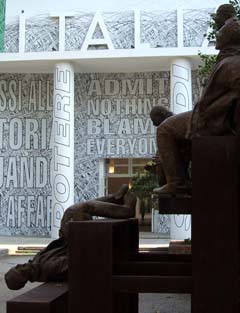
"juried" exhibitions. The first was located in the Italian
pavilion which advertised "Admit Nothing Blame Everyone". It
turned out to be truth in advertising as good portion of the juried
exhibitions were tedious political messages that blamed: first men,
then
the US, and then Capitalism. The curators admitted that they had
selected the work of artists they already knew but with the intent to
reach out to under represented countries. Maybe so. I
preferred the national pavilions. Still, there were a few gems
in the curated shows. A film piece called "Memoirias del
subdesarrollo" (memories of undeveloped) by Stan Douglas was my
favorite in the
Italian pavilion. It was a remake of a film about the life of a
young Cuban man who stayed behind in Cuba even after all his friends
had left
for Miami. It was very well done with as much left between the
lines as stated outright. The political messages were there but
weren't so biased. Just one man's very personal effort to salvage
his own
life in the face of a bad political situation.
|

|
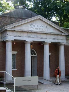
That said, I should
also admit that the US pavilion was equally disappointing.
|

|
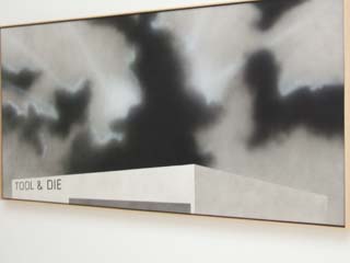
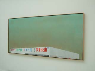
First this.
|

|
Then
this.
Times five.
The show was called: "Course of Empire". The accompanying text
was
all about Ed Ruscha's struggle to make his paintings understood.
|

|
The Romanian Pavilion
was much more daring--albeit "ala Robert Irwin". The presentation
"European Influenza" was one of the "invisible" artworks by Daniel
Knorr.
So here you have the country that gave us Brancussi but has
since been first dominated by the USSR and then has fallen on hard
times. Yet they are lucky enough to retain one of the few
permanent pavilions in the main "Giardini De La Biennale", which
exposes them to the maximum number of international visitors.
They select their one representative to the world and in so doing give
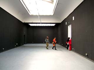
him a shot at stardom. He chooses to present an entirely empty
pavilion in a dilapidated state. The walls have been hastily
painted a flat black. No one has written on the resulting
chalkboard-like surface. Only the building and the history that
put it here remain.
An embarrassed young woman hastily explains (over and over) to a
bewildered and impatient stream of smirking onlookers that there was
supposed to be a small book to be handed out as part of the
presentation but that they ran out. If you would please sign the
guest book the artist will send one as soon as more are printed.
It was great. For me the exhibit was not so much about the
work and fame of one person but about the situation of a whole
country. It was easily dismissed as "nothing there, lets move on"
but the more I think about it the more I appreciate this solution of
how to direct the attention of the viewer. There were many
pavilions from countries that struggled with a similar difficulty of
how to address an international audience. I don't think this
piece could have worked for any of them. Most had to overcome the
oppressive overhead of the city of Venice, but Romania, with its
existing
pavilion can stand separate and distinct. Once substantial,
presently on hard times, a blank slate poised for the future. It
really was great.
|

|
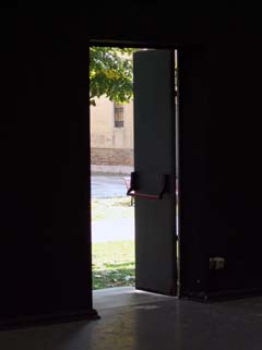
On top of all that was the slightly subversive aspect
that the back door to the exhibit, which led to the streets of Venice,
was left open and thus provided both an escape and a free entry into
the guarded Giardini (admission was 15 euros).
|

|
The Russian pavilion
required a somewhat similar effort from the viewer. The main
entry of the pavilion led to an empty room with white walls but
painted Communist-red ceiling and floor. To one side was a
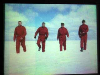
darkened room with an image of these four people dressed in red, frozen
in mid step. Whenever a viewer entered the room there would be a
loud click and the slide would change to a version of the same four
people but a little closer to the viewer. The sound emanated from
near the doorway so that the entering viewer's attention was directed
toward the causal effect of their having entered. The light beam
used to detect a new viewer was intermittent and would only trigger
every few seconds.
One problem was that a lot of people stopped at the doorway
before passing through the sensor. One woman stood blocking the
sensor for some time wondering what people were looking at before she
said, in an American accent, "its like watching snow melt".
Finally, she moved and the process resumed. It took about twelve
viewers and perhaps two minutes to get to the point where the people in
red were close enough to fill the screen. At that point there was
the sound of a cannon and the images changed to a series of the people
falling back to the starting point.
Most of the viewers just sort of came in, glanced around and
left but some lingered to see the whole sequence. Just outside
the door to the darkened room there was a page that explained the
thought behind the piece saying that the artist wanted to interact with
the viewer. Very few people read it.
|

|
The Austrian
exhibition offered something for both the impatient and the
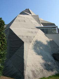
inquisitive. The exhibit itself grew right out of their pavilion
so you were rewarded without even having to enter. Once inside
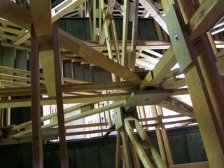
the viewer was invited by a series of stairways to traverse through
walls and skylights up inside a scale model of a mountain.
|
 |
This is a view looking
down through the structure and staircases at the roof of the original
pavilion building.
|

|
The crowed seemed to
delighted with the clear goal of mounting to the highest point where
there was a small hatch that allowed a view out. Note that many
of viewers responded to their successful navigation of the winding
staircase and the isolation of being alone on top by leaving their own
mark. The graffiti was in every language but mostly said "was
here".
|

|
For the inquisitive,
there were many other such hatches at lower levels on side routes but
they were not so popular as the one at the top and didn't sport
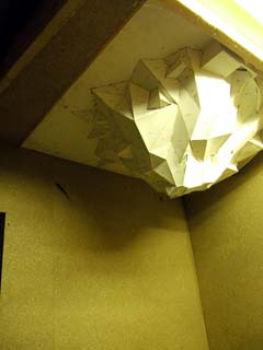
graffiti. Hidden off to one side was a small room that contained
a scale model of the exhibition (hanging from the ceiling), a PC
showing aerial photographs, a topographic map of a mountain in Italy (I
expected it to be in Austria) and some pictures of that area and
illustrations of mountain climbers. Perhaps there was an
explanation of why this mountain Pontebba was so important but if so it
was hidden even more cleverly because I never found it.
|

|
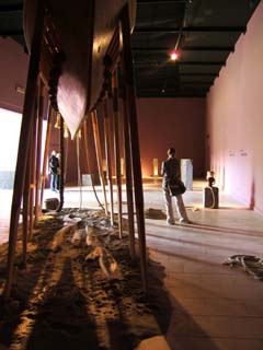
The Israeli pavilion
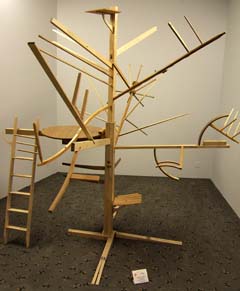
presented the work of one artist, Guy Ben-Ner. There was a
sculpture made of furniture parts at one level and a video of the
artist interacting with the sculpture on another.
|

|
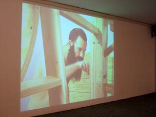
Over a course of
perhaps ten minutes, the video showed the artist (wearing underwear and
a fake beard) first lying on a mattress at
the base of the "tree" looking up at it then discovering that there are
tools and hardware hidden in a small drawer in side the trunk of the
tree (shown at left) then slowly reconstructing the furniture that was
used to make the
sculpture: a chair, an umbrella, a table, a rocking chair, and a
bunk bed. Sometimes, the same part would be used for more then
one
purpose. Some of the manipulations of the component parts
included hinges and special latches so that the process was more
involved than simply taking the whole thing apart and putting it back
together again. The video was filmed in the pavilion.
At each step the sculpture remained cohesive. The video is
presented in a series of short performances like the assembly of the
chair or of the table. The impatient viewer could stay for one
piece of furniture and then leave feeling satisfied that the rest was
more of the same. I watched until he had disassembled the
whole sculpture into furniture. Perhaps he reassembled it.
I don't know.
This piece was really well done and was the favorite of a couple
of people who I spoke with.
|

|
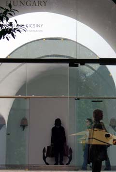
The Hungarian pavilion
presented the work of sculptor Balazs Kicsiny. The installations
narrated various frustrations of modern life such as this one showing a
man packed to travel but anchored. He is flanked by
bee-hives. I am noticing that the ex-soviet countries have
artists that are quite adept at portraying the conflict between
individualism and the collective.
|

|
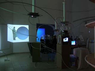
The Belgian pavilion
was full of all kinds of crazy "machinery" connected by tubing and
wires. Each station projected an image.
|

|
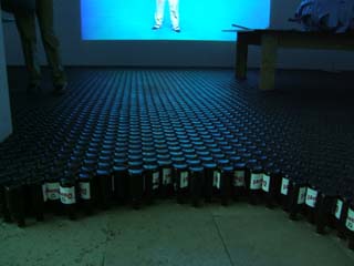
My favorite was the
room paved with inverted beer bottles (but then I have a weakness for
Belgian ale). The first few rows of bottles were glued
together but the rest jangled as the viewer walked on them.
|

|
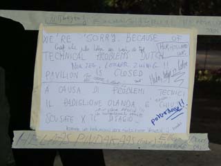
Some of the pavilions
were closed. The crowd was not sympathetic.
|

|
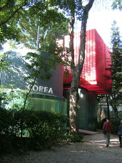
The Korean pavilion
was hidden in the trees of the garden.
|

|
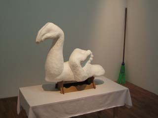
The Korean Pavilion
had work from a number of artists. This piece by Kim Beom was
fun. It is carved from styrofoam. I have a soft spot for
artists who can work materials so well and for images that present
multiple forms. To me the subject and presentation are
intrinsically Eastern and immersed in their tradition but the material
choice brings it into the present and offers an invitation for direct
participation (as opposed to viewing someone else's culture from a safe
distance). The choice to use male arms changes this piece from
what I would have expected. All in all a very nice piece.
|
 |
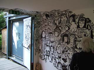
I have been paying
attention to graffiti so was surprised to see it creeping into the
Korean exhibit.
|

|
The Egyptian exhibit
was one of the few that was entirely sculptural. My interest in
sculpture caused me to pay more attention to the sculptures which were
actually a small minority of the overall biennial. Biased as I
am, I felt that installations such as these by Nagi Farid and Salah
Hammad allowed the viewer to immerse themselves in the presentations.
|

|
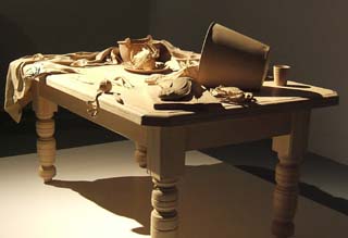
By far the most
extravagant display of raw talent was the Australian pavilion full of
wood carvings by Ricky Swallow. The whole exhibit was about
skill. The choice of topics related somewhat to the artist but
was mostly in the classical tradition. To me, the work is this
artist's effort to refute the claim that the old masters cannot
be beaten at their own game; that art has to go in some entirely new
direction. It was a refreshing change from the rest of the
Biennial.
|

|
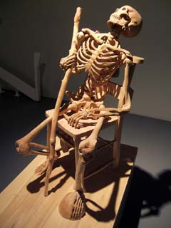
This piece would have
been impressive enough for its accuracy if it had been carved of
separate parts and assembled but it was hewn from one laminated block
so most of the cutting is against the grain and required hollowing out
many inaccessible cavities.
|

|
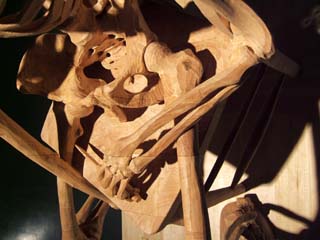
Note the line of the
original block passing through the leg bones, wrist, knife blade, and
chair below. He is showing off.
There were warning signs pleading to not touch the work because
it was so fragile. |

|
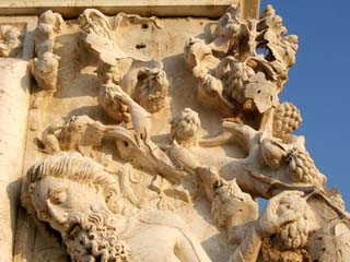
Venice is covered with
so much masterful artwork that it often blends into the structures that
it adorns. I was overwhelmed. Sleep.
|
